Design System (WIP)
Under Oath. App Design System Preview
Overview:
Side projects are where I get to push my craft without constraints — and this one's been a genuinely fun challenge. Building a design system for a political app forces you to make color decisions with real intention. Party colors, status indicators, constitutional scores — everything has to coexist without stepping on each other or implying something unintended.
The result is a system built for nuance: flexible enough to scale, deliberate enough to handle a politically charged context gracefully.
Disclaimer: The subject matter is intentionally kept vague. Any political references visible in the components — party colors, politician names — exist solely to demonstrate the design system's constraints, not to make a statement of any kind.
Situation
The hardest design problem wasn't aesthetic but structural.
Red and blue exist in this app, but they can't behave the way they do in most political contexts. They're meant to represent data, not brand. A party affiliation badge and a "broken promise" indicator can't share the same red. A party label and a primary CTA button can't share the same blue. Every color decision had to answer one question first: does this color mean something politically, or does it mean something functionally?
The goal was to build something that felt credible and serious without feeling like a government website — and non-partisan without feeling sterile. Those two tensions shaped every decision in the system.
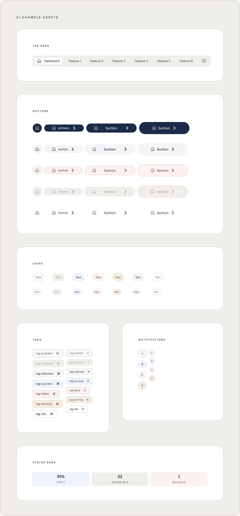
Design System Preview

The Color Decision
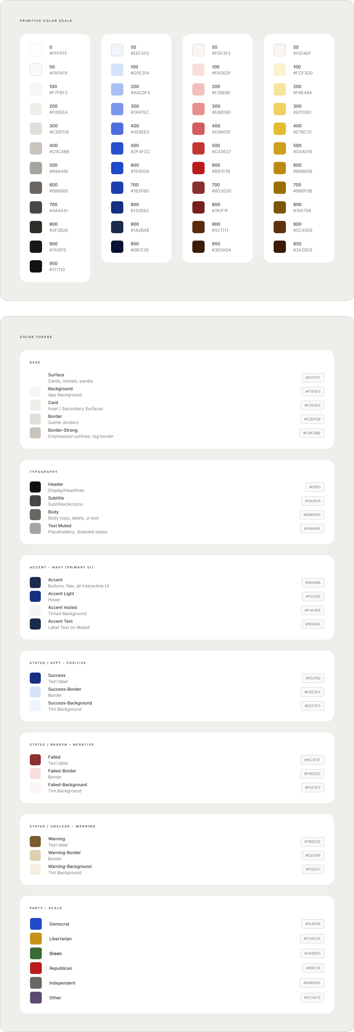
Political topics carry emotional weight — especially now. I chose navy as the primary UI accent not as a partisan signal, but for what it communicates psychologically: it's calming, trusted, and doesn't overpower. It reads as institutional — closer to federal letterhead than to either party's brand color. More importantly, it's visually distinct enough from the Democrat blue (#1D4ED8) in the system that the two never get confused, even at small sizes like a 20px party badge.
Party colors, Republican red, Democrat blue, Libertarian gold, Green Party, Independent gray, and Other — are isolated to a single use case: the affiliation badge next to a politician's name. They appear nowhere else in the UI. This rule is enforced at the token level, not just in practice.
The trickiest problem was that Republican red and the "broken promise" semantic color needed to coexist in the same system without being confused for each other. The solution was a tone shift: Republican uses #B91C1C it's bright, saturated, a recognizable party signal. Negative/broken uses #8C2F2F — darker, more muted, brick-like color. A severity signal, not a political one. Side by side they read as different colors. In the system they serve completely different roles.
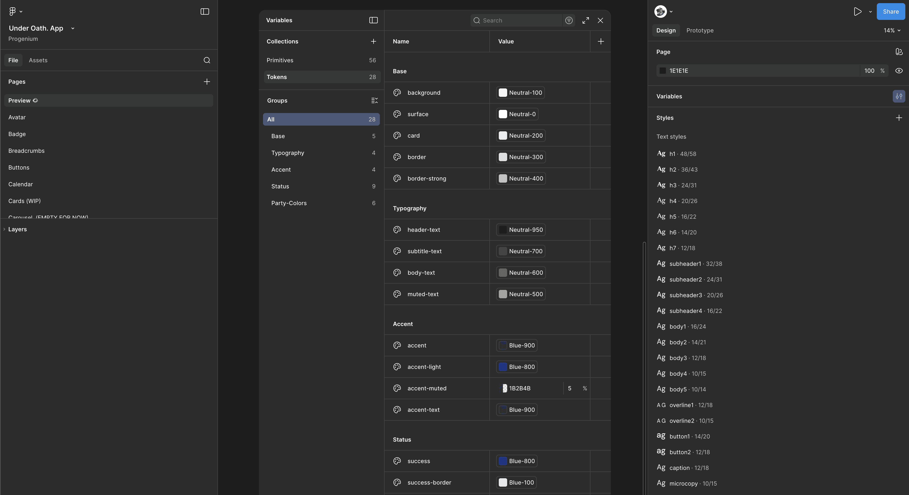
Tokens
The standard traffic light palette — green, yellow, red — was an early candidate and an early rejection. It's not that it doesn't work, it's that it feels cheap for this content. The data this app surfaces deserves more nuance than a stoplight, and the warm parchment palette made saturated greens and yellows feel inconsistent from the start.
I explored three directions: a monochromatic navy scale where all semantic states lived in one color family, a minimal "ink only" approach where only negative states got color, and a desaturated earth tone palette. The final system landed between the first and third — navy for positive states (cool, institutional, affirming without being celebratory), warm stone (#7A5C2E on #F5EFE0) for unclear or partial records, and brick red (#8C2F2F) for negative states. The warm stone was a deliberate choice over neutral gray: an unclear state isn't the absence of information, it's a state worth noticing. It needed its own identity — just not an alarming one.
Pages, variables and styles oh my.

Lessons Learned
This is my sixth design system built from scratch. Each one teaches you something different. This one taught me how much color decisions compound when the content itself carries political weight and every choice has a second-order consequence.
What exists here is a system a developer could pick up today. Token names are semantic, scales are complete, component states are documented, and the rules around party colors are explicit enough that they survive handoff without a conversation. I built this because the app deserves to be built right and because I believe in the mission behind it enough to do the foundational work before writing a single line of app code.
I look forward to telling you more about it when the time is right.