
Consumer Banking
Progenium Consumer Banking - Concept Recreation of USMM Console due to NDA. Flow and thinking reflect shipped product.
Situation
Our existing consumer banking web platform felt visually dated and disconnected from our newer mobile experience. The interface lacked cohesion, and the dashboard did not fully leverage the additional screen real estate available on web.
At the same time, we were thinking about the future direction of our Next Gen Consumer Banking experience. It needed to feel modern enough to attract younger users, while remaining intuitive and accessible for long-time customers.
This project began as a self-initiated design exploration. I set aside time on a weekend to rethink what the web dashboard and transaction details experience could look like without being constrained by our current design language.
Task
As the sole Product Designer, I challenged myself to:
Redesign the consumer banking dashboard and transaction detail pages
Create a modern, cohesive visual direction aligned with mobile
Leverage the expanded space of web without overwhelming users
Explore interaction patterns specific to desktop (e.g., hover states)
Ensure the design remained usable for both younger and older demographics
Although this began as a concept exercise, the goal was to produce something practical enough to influence our real Next Gen web direction.
Actions taken
I began by questioning one of my initial assumptions: that web should mirror mobile 1:1.
At first, I thought the safest path would be to reuse mobile components directly. But as I explored further, I realized web offered opportunities to enhance the experience rather than simply scale it up.
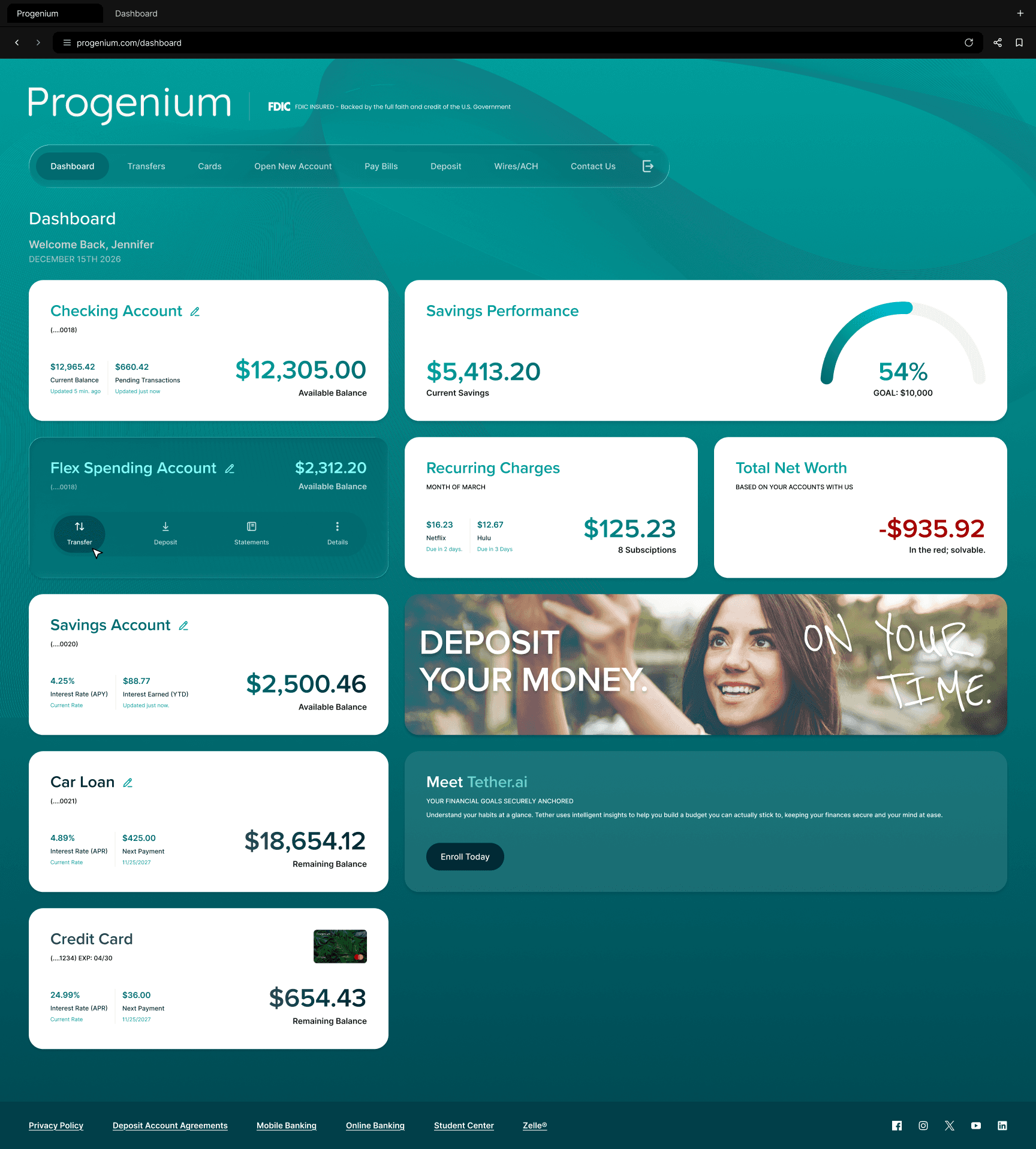
Dashboard Redesign
I restructured the dashboard to make it more informative at a glance.
Enhancements included:
Adding contextual data directly onto account cards (e.g., interest received, loan payments)
Incorporating credit card imagery to make accounts more visually recognizable
Creating a dedicated widget area for peripheral information
Designing hover interactions to provide layered information without cluttering the interface
The goal was to improve scan-ability while giving users deeper insight into their financial standing without forcing extra clicks.
Transactions Detail Page
For transaction details, I focused on clarity and hierarchy — ensuring users could quickly understand what happened, when, and why. I refined spacing, typography, and grouping to reduce visual noise while maintaining completeness.
Throughout the process, I explored ways components could expand or reveal more detail on web while collapsing appropriately on mobile — thinking ahead about how engineering could conditionally render content based on device type.
Because this was a solo exploration, I had full ownership over layout, interaction, and visual direction.

Result
While this began as an independent concept, elements of the exploration influenced the direction of our real Next Gen web platform.
The work helped:
Establish a more modern and cohesive visual language
Bridge the gap between mobile and web experiences
Demonstrate how additional web real estate could enhance usability instead of duplicating mobile layouts
More personally, this project sharpened my ability to:
Challenge my own assumptions
Design beyond existing constraints
Think systemically about cross-device interaction patterns
Reflection
If I were to revisit these concepts today, I would refine the visual polish — particularly improving background and foreground contrast to create stronger depth and accessibility.
These designs remain a work in progress visually, but they successfully illustrate the structural and experiential improvements that later carried into the real product.